Friday 31 July 2015
Monday 20 July 2015
All the Underground hits, All the Modern Lovers Tracks
I like to think that I am still in the process of developing my edge. It's not very easy to keep it. Trends move so much these days, once you get known for something boom, it's not stylish anymore.
Anyway, I chose to do something in a timeless style to represent one of the most important era's in music. It is the most inventive time in music. I think... I have been wanting to do magazine cover for a while. So I bet you can guess what you are going to see.
Swiss design, a monospaced typeface and some classic images of bands; pre-punk/punk/Post-Punk is that what you were thinking of
Losing My Edge, the LCD Soundsystem track is what I am referencing throughout this post and this piece of design...if you are not so musically inclined to GOOD MUSIC. I have recently collaborated on a cover of the track with my brother. Stay tuned for the audio.


Post #167
To celebrate this spectacular landmark, I am pleased to announce that it is today that I start my internship at NME HQ so thats great. Stay Tuned for updates. Love You all.
Sunday 19 July 2015
blue and orange
New website is complete. Please please have a look. I will love you forever.
http://jamesreaydesign.co.uk/
Friday 17 July 2015

Thursday 16 July 2015
biking, photographing, surfing, designing, artisting, biking, illustrating
Before I left the UK, I bought another magaizine, a magazine I had never seen before. A magazine of interviews and personal stories from the great and good of random people. Ranging from photographers, designers, artists, bikers and illustrators. The editorial style again also melted my mind.
Type on it's side, drop caps, odd grids and beautiful typefaces. I was hooked. I have since read most of it and learned more about biking, photographs, art and surfing, than I ever thought that I would. ever. to be honest.
PS the magazine is called huck if your interested.


 |
| A bonus addition, this vans ad is beautiful |
Wednesday 15 July 2015
Lost in Translation.
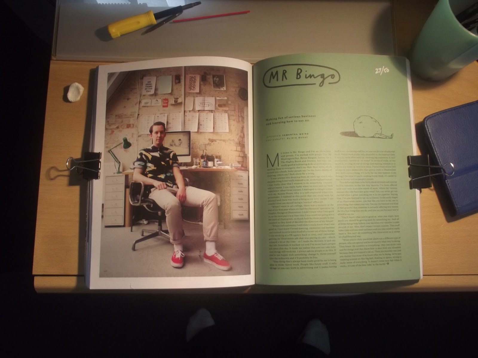
Have you ever bought a magazine that you could not read? A magazine that you you know that you would love to read? with articles on Sleaford Mods, Wire, Mixtapes and Blur? Well I did on my last day on holiday. Mucchio is a music magazine with a beautiful editorial style, which is the reason I bought it.
The illustrations are lovely and fit so contextually well within the spreads. The colours are lovely, the layouts are dynamic and the back page is advert, which is also well illustrated. My feet do feature in all of the photographs below to demonstrate it's beauty. Hopefully complimented by my fake mockup stylee.


The illustrations are lovely and fit so contextually well within the spreads. The colours are lovely, the layouts are dynamic and the back page is advert, which is also well illustrated. My feet do feature in all of the photographs below to demonstrate it's beauty. Hopefully complimented by my fake mockup stylee.

Front Cover that confused the cashier.

Lavely coloured illustrations & coloured text dividing the
forms of type without needing to section it off.
forms of type without needing to section it off.

a record illustration built from waves

Dynamic Layout, very confusing but dynamic none the less

"Hey, should we just use red on white page"
"Nah, just reverse it out and make James gasp"
A music technology festival when I am not there.
Tuesday 14 July 2015
Thanks Murdoch


Monday 13 July 2015
Eye didn't see it, Eye sore it
You can't quite grasp how a nation who are in love with futura can get somethings so wrong. I mean design is subject that is fine with me, I never claimed to be an all round tasteful guy you sometimes you know you have got something wrong. see the below examples to truly understand the issue at hand.
Please be aware the following sequence of images may cause discomfort to those people used to browsing behance and (in the main) Pinterest.
Please be aware the following sequence of images may cause discomfort to those people used to browsing behance and (in the main) Pinterest.
 |
| a : "I did a graffiti" b:"whats one of them?" a : "I don't know, but I did one" |
 |
| click to zoom in at the pigeon English and blandness. |
 |
| Hobo and not for the first time. |
 |
| don't hold yer bottle up to the window children, it's not thirsty. |
 |
| who needs a logo that remains the same? lets paint each individual one uniquely. |
 |
| here we see a nice poster for a film/play/thing that references my favourite pop artist next to a font that uses Hobo, a naff colour scheme and warped text. |
 |
| legibility, we don't need that. |
 |
| Hobo and Disney font for a cafe based on elephants. Genius |
 |
| who needs a Calvin Harris THAT big? |
 |
| if you say it in Geordie accent it sounds amazing. but it's accurately hawaii in Italian |
 |
| Leading and tracking issues, with the stacked English & Italian lines. |
 |
| Last but not least good Jazz while you eat but bad design too |
Sunday 12 July 2015

Saturday 11 July 2015
you go EXPO

The most frequently seen piece of design wast this beautiful piece of branding for the Milano EXPO 2015, a food festival to be held in Milan but promoted across the country. It's all about the "being able to guarantee healthy, safe and sufficient food for everyone, while respecting the Planet and its equilibrium" which is a great cause. The colours are fabulous and exceptionally eye catching. The way it's set out doesn't effect legibility which I feel is key with something as important as this. Whats fabulous, is it works on everything, I bought a notebook with this on the cover but it's on t shirts, pencils and mugs. it looks so good. Just thinking about it now makes me want some parma ham and cheese sandwich mmmmm.

Friday 10 July 2015
Futura-esque
In the UK, Public signs are usually in a soft edged sans serif like a Arial rounded bold; as seen below in my Hadfield trust site branding. I must repeat road sign are not in this for legibility reasons.
But this is not the case in Italy, a sharp edged font that is my favourite of all of the typefaces (that I
have seen)(so far...) was very prevalent in italy. Futura with all of
it's quirky little cutting in the letter where would normall be flat and
your odd lower case J. It is futura or it is indeed futura-esque,as I like to call it. so below are some of the many examples. with witty intelligent captions to go with them, so brace yourself.
 |
| a blog post about the full branding is coming soon |
 |
| who wouldn't want a floor sized piano? |
 |
| Catholic Church sounds so much cooler in Italian |
 |
| unknown Italian designer brand approves |
 |
| that metro map look familar. Underground have you taken a holiday? |
 |
| and the largest use, I have ever seen |
 |
| Here we see a nice rare example of an italic Futura. |
 |
| who is that sexy reflection? |
 |
| The Romans used it in the coliseum... |
 |
| there he is again |
 |
| and again in the Forum. |
 |
| the pope approves of its use in the Vatican. |
 |
| first sight on Italian soil |
 |
| Cos I'm up in a train station at midnight |
Thursday 9 July 2015
I'm Back
Back from 10 days of sun, sun cream and back to Sunderland. I come bearing gifts from my travels so stay tuned for blog posts about typography, (super)fly Postering and holiday snaps done by yours truly. As well as posts that I promised before. Believe the hype.
Cheers James

Cheers James

Subscribe to:
Posts (Atom)